Biteable Video Editor Concepts
Note: This started out as a project page to show my concepts, but these have since been used as a basis for a new video editing page. I've added a few preliminary details about the work below, but a full case study is coming soon.
Biteable's tagline is "the world's simplest video maker". Biteable allows people to make their own animated or explainer videos online.
When I first started with Biteable, they initially tasked me with some small design tweaks and new features but they then asked me to have a look at the core video editing workflow.
The video editing workflow had some problems, in that new users didn't always understand what they were looking at. Users needed to perform a few core tasks within the app before they'd be "activated" – i.e. truly understand the value of the service.
In a short period of time, we needed to help users understand:
- That they are adding scenes to their video
- That they are customising scenes with their own text
- That the scenes reside in a video timeline
- That they are customising their video with colour and music
- That they can then "build" the video preview (unfortunately a slow and server-intensive process)
Sometimes users would bounce at the first step without looking at the scenes in the timeline, or sometimes they would rush through to build the video without customising any scenes (missing the key value).
The Biteable founders had some ideas they wanted me to explore, such as a vertical timeline and vertically-scrolling scenes, that they thought might help simplify the interface and help users understand it quicker, but they also were interested to see some "blue sky" concepts for how the interface could look.
I researched some similar products, looked at their user flows, and watched user tests of new users going through the Biteable app.
From my research, I felt that the wizard steps of the current interface were confusing. The second and third steps – "Colour" and "Audio" – are optional video settings, while the first wizard step, "Timeline", is where the core video building task takes place. Users would frequently end up on the second, third or fourth steps without having interacted with scenes or the video timeline.
I presented my initial designs to the team (a selection of which are below), incorporated feedback, and identified individual features that we could discuss, research further, prototype or A/B test.
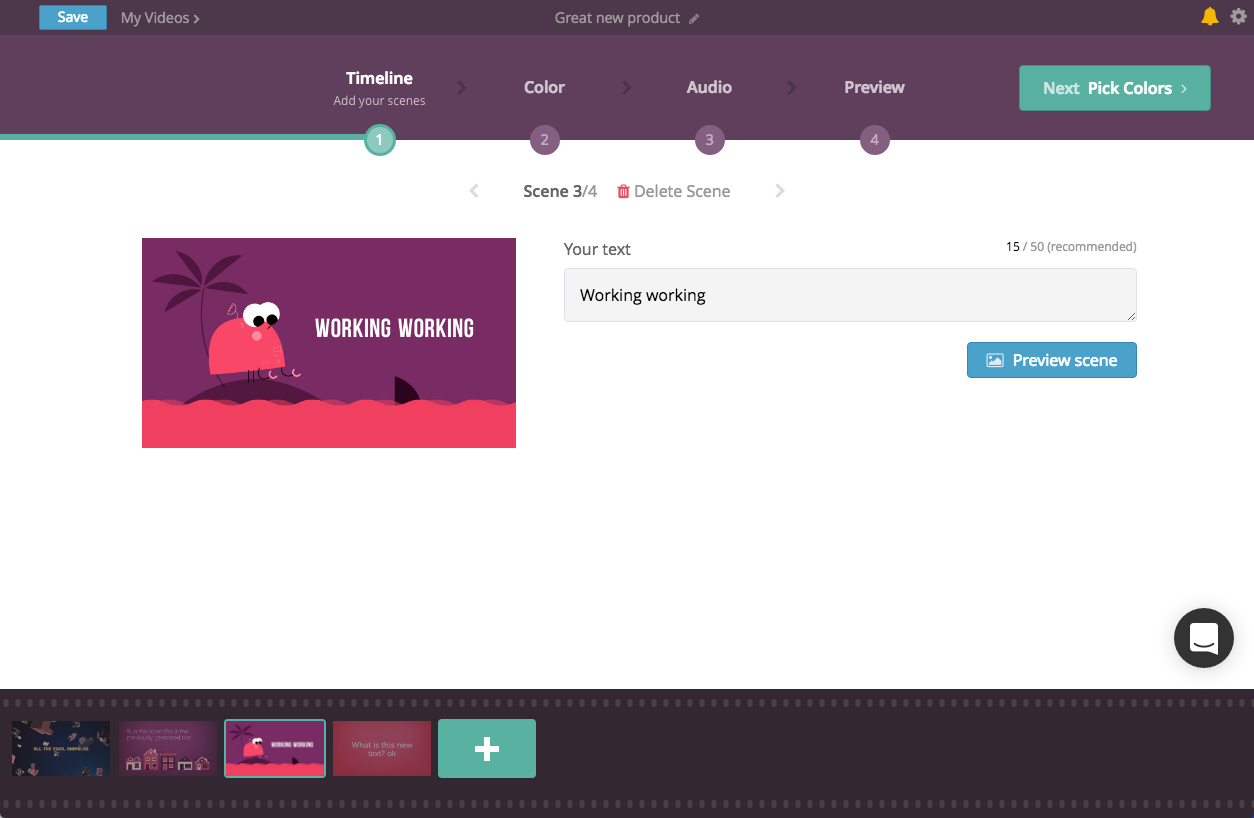
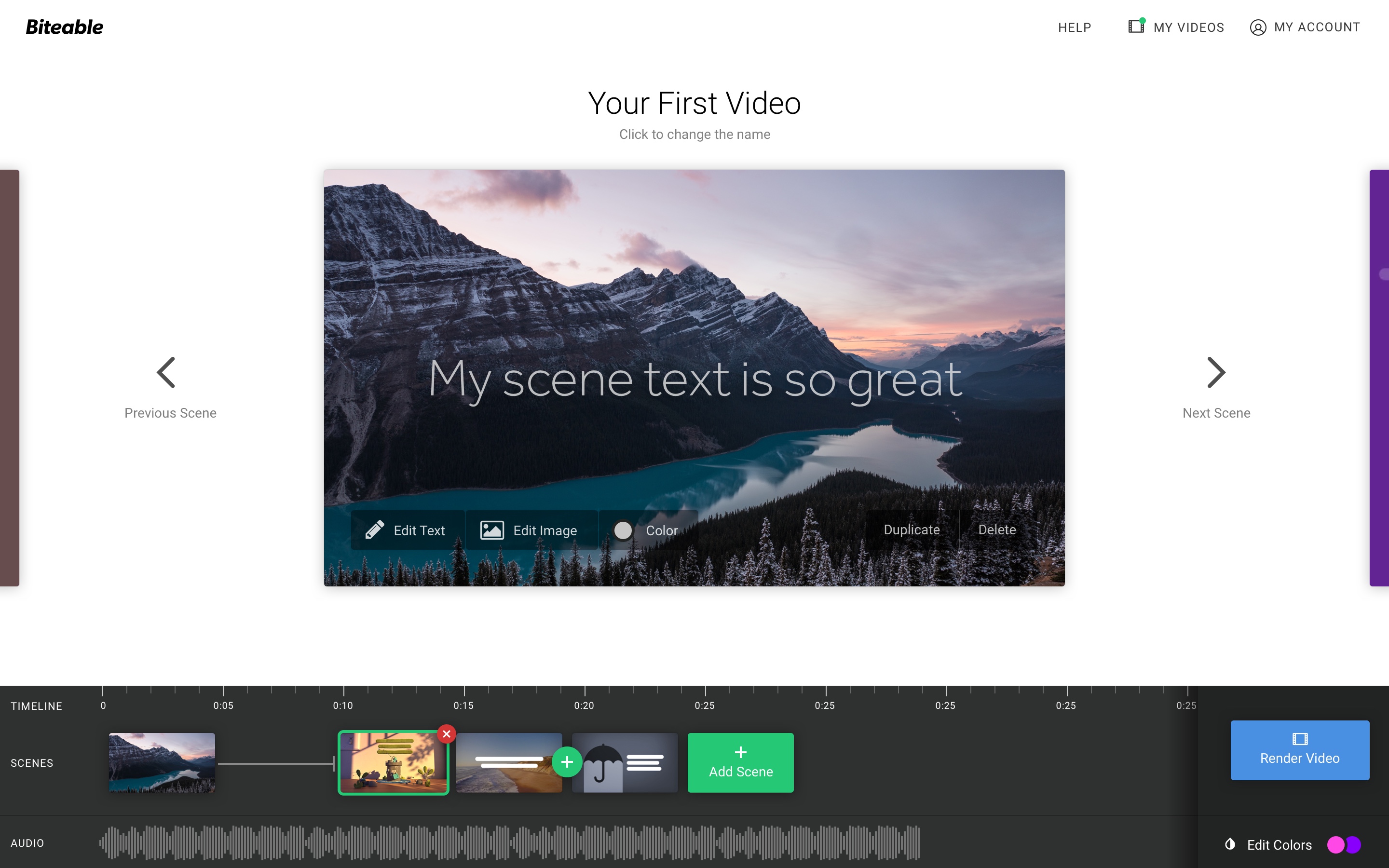
Current interface
Initial concept
Minimal, vertical-scrolling scenes
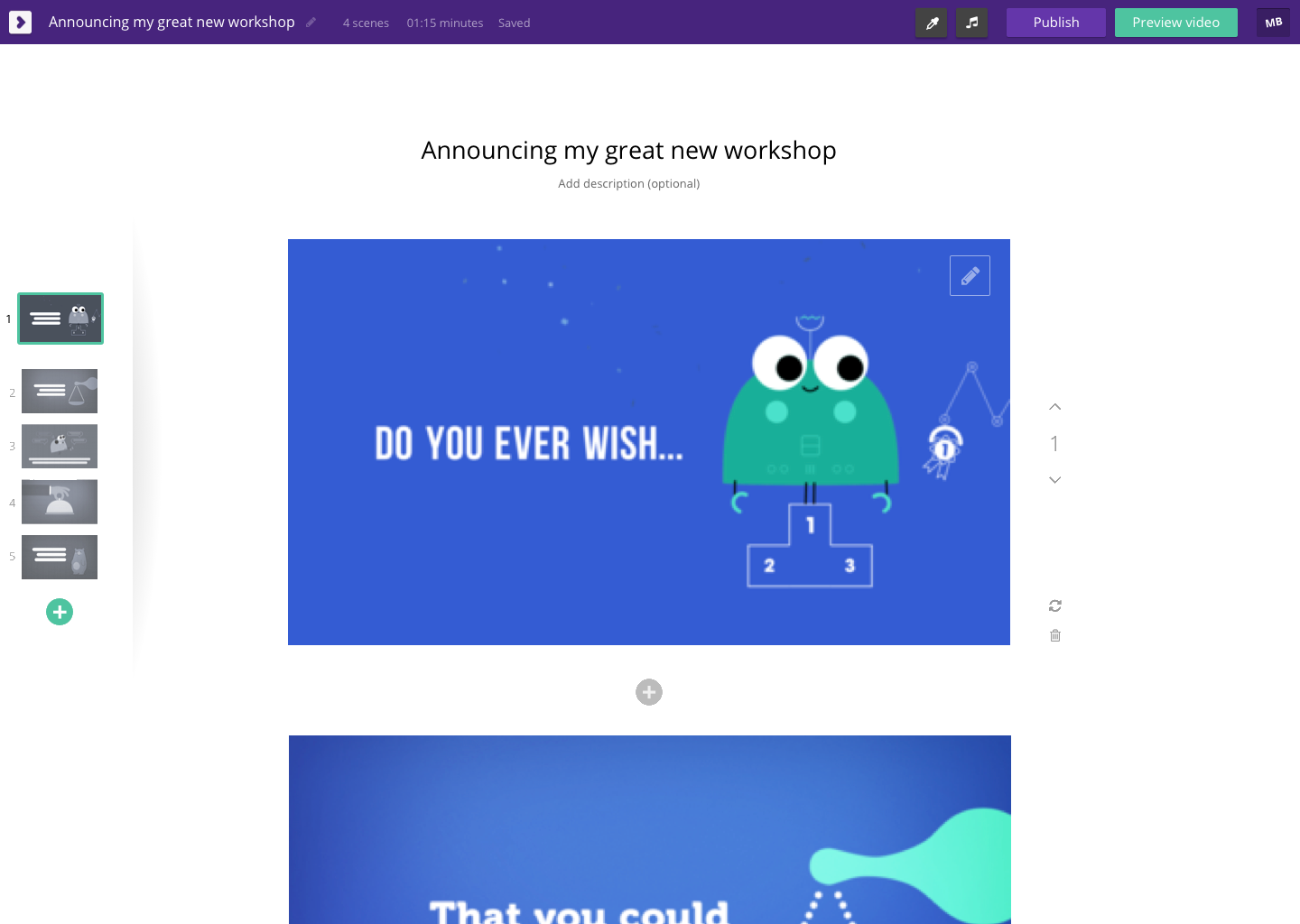
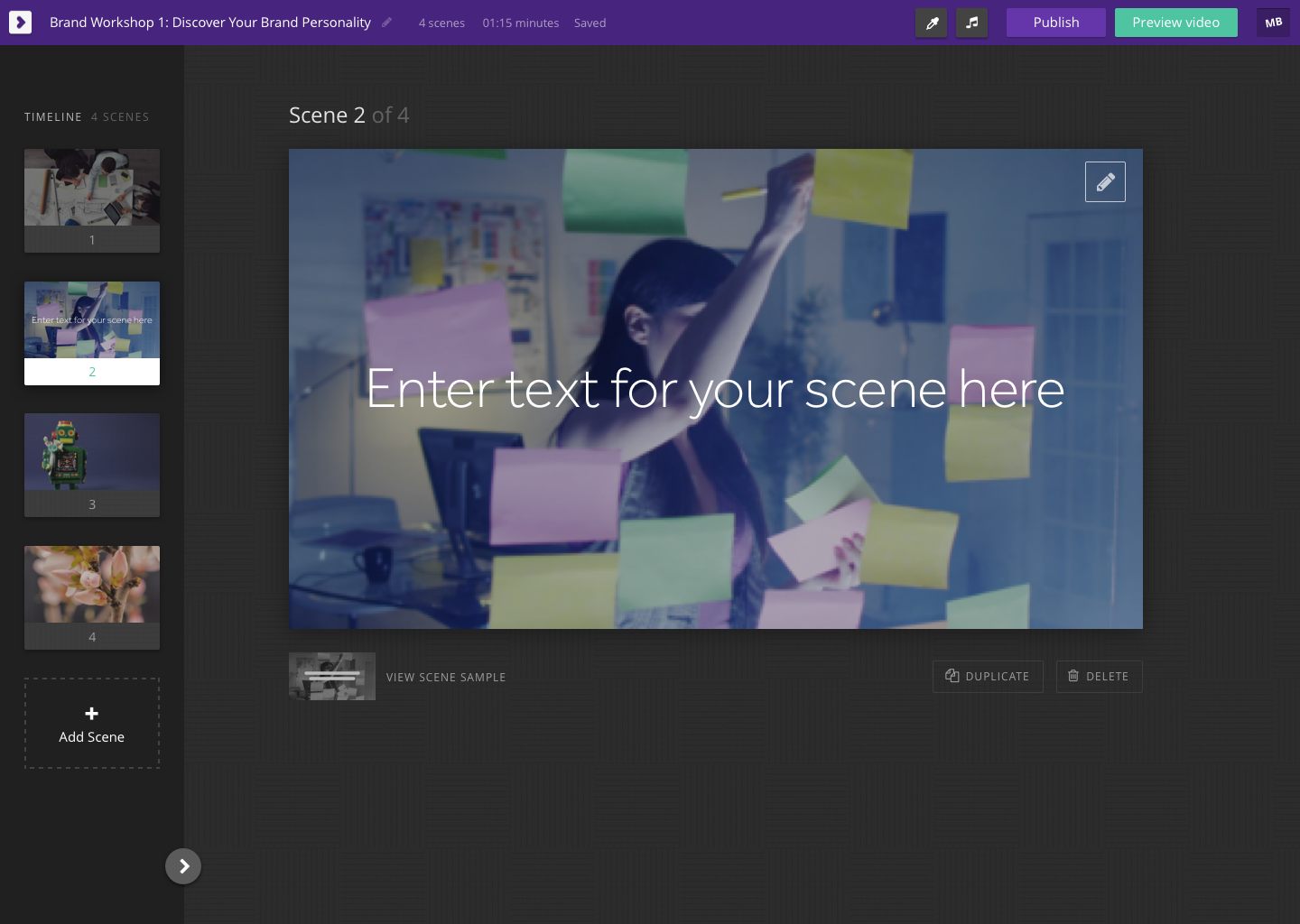
Second concept
Vertical timeline + dark colour scheme
(Horizontal + light colour scheme options were also presented)
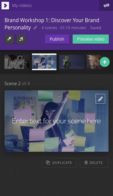
Mobile version
Using the previous work as a base, I teamed up with another designer for a 'pair design' session. This was our first session of pair designing. We found we iterated very rapidly and were pleased with the results.
The new concept combined my minimal style (removing the wizard steps) with more up-to-date brand cues from the main marketing website, along with some new ideas for scene editing and the video timeline.
Concept from pair-design session
We tested the new design concept as a static design and found that people seemed to quickly understand the more minimal interface, however we're also continuing to explore alternative concepts for keeping the wizard-steps workflow while making it more intuitive.
We have since implemented some elements and are rolling them out with some thorough A/B testing to test our hypotheses.